PHLASK Desktop Overhaul
Redefined user flows and updated visuals as a large 2.0 push to better accommodate a slew of new functionality.
Problem
With PHLASK 1.0 already out, we had the idea to expand functionality. The new features would break the previous version of the page. To exacerbate the problem, mobile and desktop were using 2 separate component libraries / design philosophies.
Solution
Visual overhaul to all areas of the system, allowing for current and future increases in functionality.
Result
Balancing a mix of delegating to a rotating cast of volunteers and setting up a new desktop component library to match the work being done on the mobile team, we reached a new more flexible visual framework for future expansions.
This new visual styling allowed for…
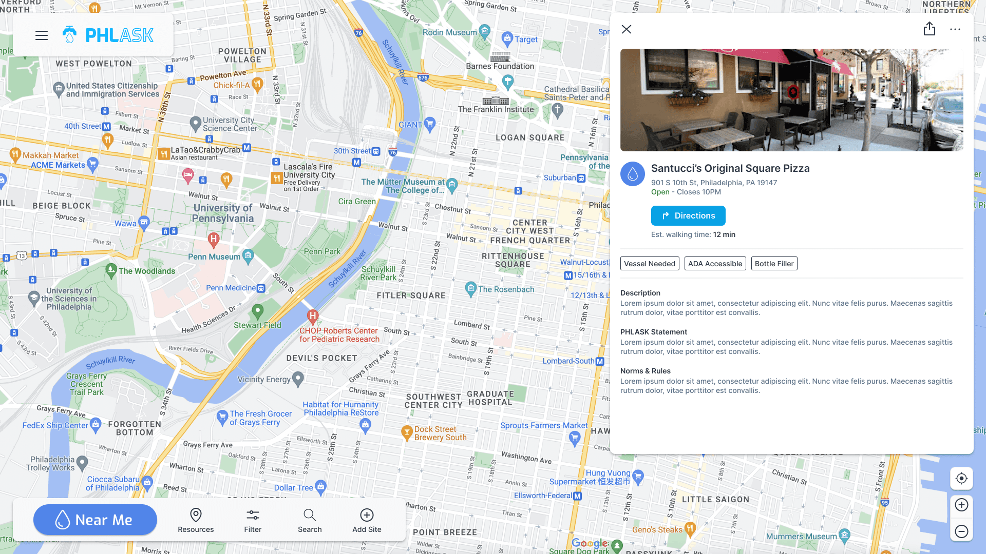
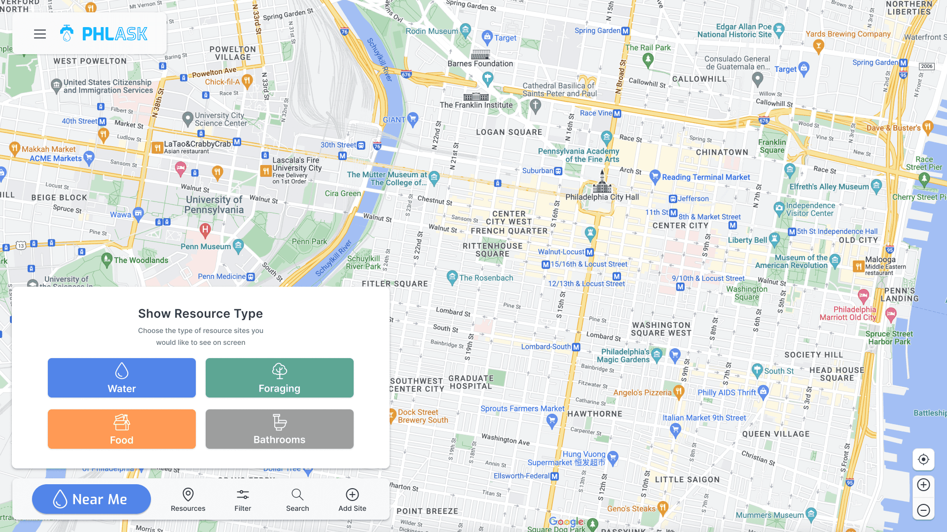
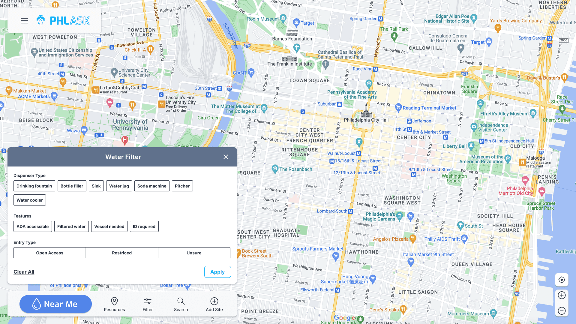
Two new types of information being displayed on the map
Tags of key info on site modal
14 New filters
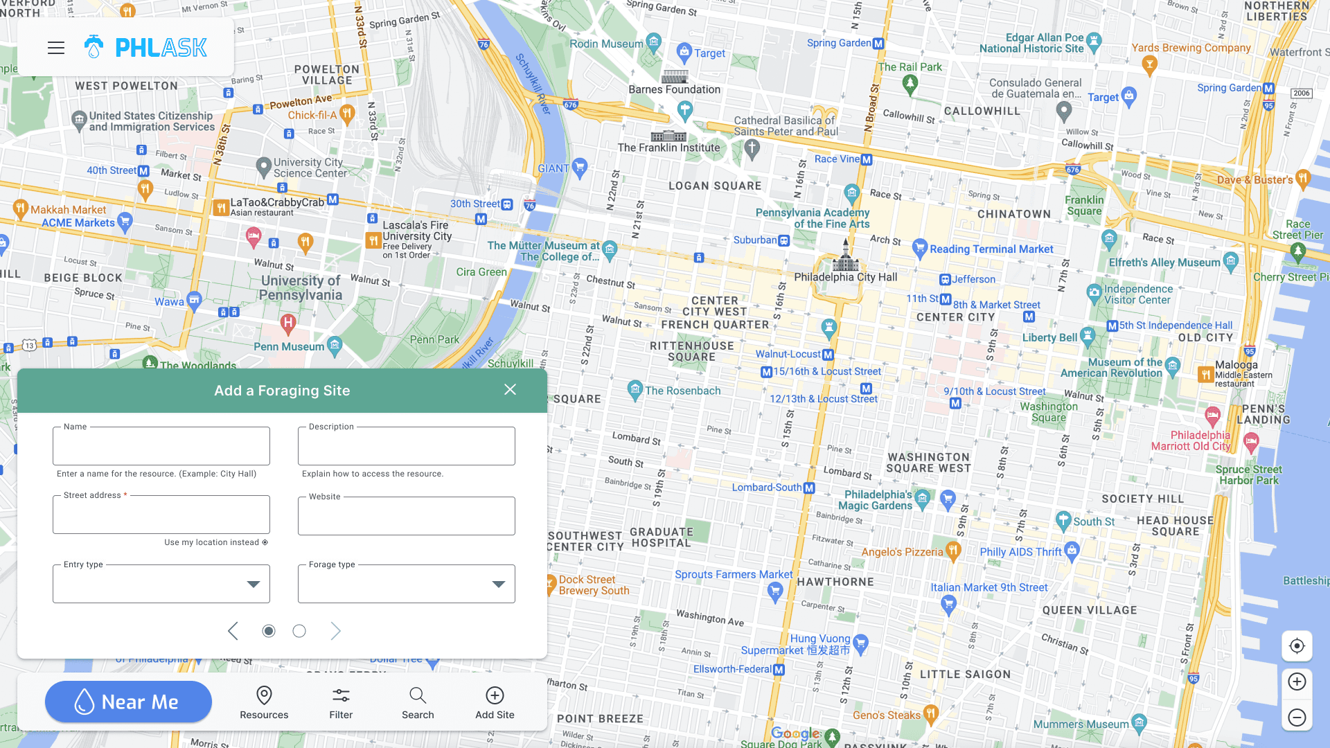
Crowdsourcing forms
Between the new features, styling, and work on the backend (both to handle everything + tracking by the data circle), we saw a huge increase in web traffic.
7x Increase in weekly unique users
We were advertising with a mix of posters and screenshots of the site across multiple market points.
12% Growth in 2nd page follow through
Not only gaining users, but the right users connecting to the changes we had made to the site.
32% Expansion of pins on map
These new users were using the new tools as intended to share resources in the Philadelphia area.
Background
PHLASK is a non profit based out of Philadelphia aiming to help users find and share resources in their area. This is done via a crowd sourced map of pins holding key info on what resource is there and how to access it. Starting as a way for the non profit to post food and water during the pandemic to a mobile first version of the website, it was time to increase the functionality closer to the end goal.
Through previous research we determined three key user demographics that utilize the site.
Gig / Delivery Personnel
Visitors / Tourists
Unhoused Individuals
We discovered that while the second demographic generally found the mobile first site, focused on water to be suffice the other two demographics found missing functionality that was to be scoped into the 2.0 release.
(Old PHLASK)
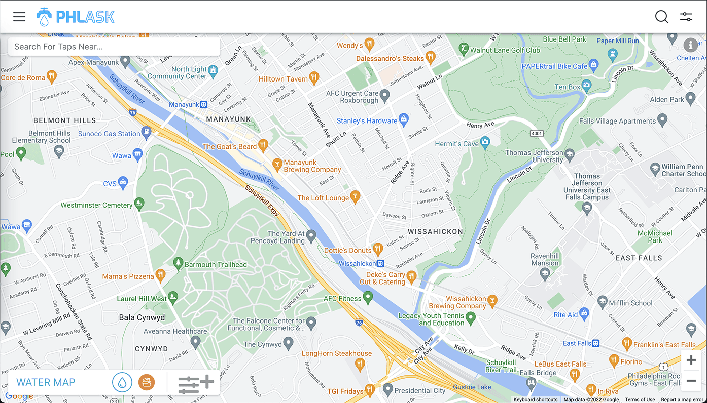
Desktop Site
We found users who relied on the library for internet access to find the mobile first approach to the desktop site to be lacking.
Bathrooms
Individuals who mostly used this while gig working found the water to be helpful but heavily requested the addition of a bathroom feature.
Research
The mobile library had a head start from previous work done on the component library, so we had a general idea of the direction to take the desktop version. Much of the research was to A) Discover how other similar sites handled the larger screen real estate and B) Make sure we were not breaking any major flows.
Competitive Analysis
We found many websites handling aspects of what we did. Some were only mobile, some were only one type of resource we wanted to share.
One of the closest map based, resource sharing was a food focused site called Food Helpline. While not crowd sourced, they get information directly from food banks and other non profits, they display information very similar to what we collect.
The other site that, while not displaying any resources or a non profit, that was a great example of converting from a mobile site to a desktop variant of a map, was Google Maps itself.
User Interviews
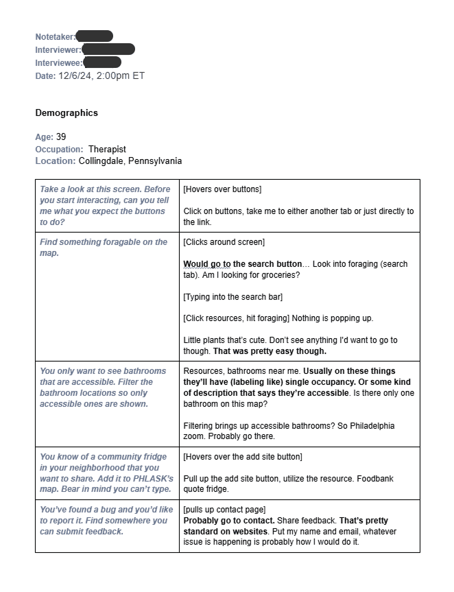
We had a rough idea of the direction but we wanted to confirm that we were not breaking any major flows while adding. Being an agile non profit, we're willing to break a bit and fix as we go. With that being said we strive to reach an acceptable baseline of "would you use this?".
Organization standards aim for a minimum of 5 individuals per batch of testing, but due to the size of the project we set are sights a bit higher. In the end we gathered
8 participants
Ages 25 - 50
5 Different Cities, 2 Countries
The largest concern we found wasn't related to the desktop specifically.
We introduced a new feature to open up the nearest selected resource to the user. We called this the "PHLASK" button. We found that to be a large drop off point with first time users.
Finished Designs
With the PHLASK button the only major issue on usability we went forward updating both component libraries to a single source and using what we found in the competitive analysis to fully use the screen.
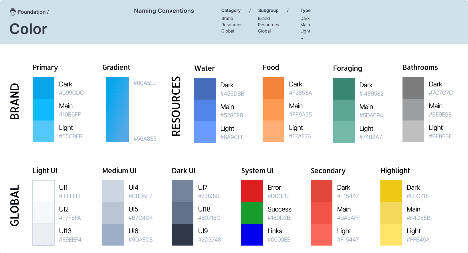
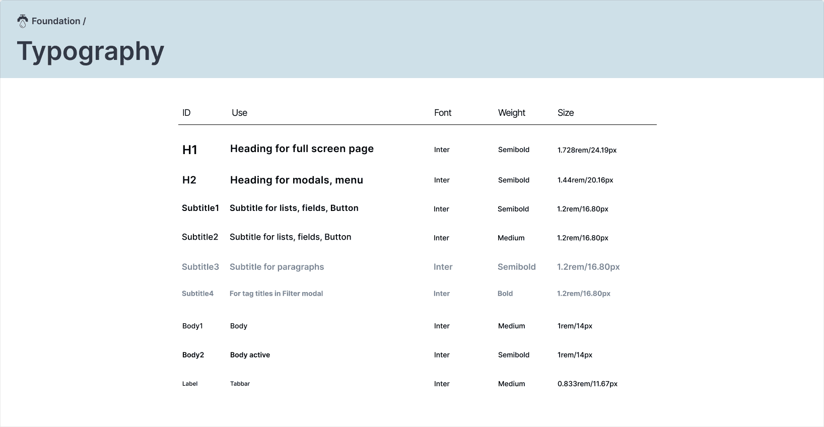
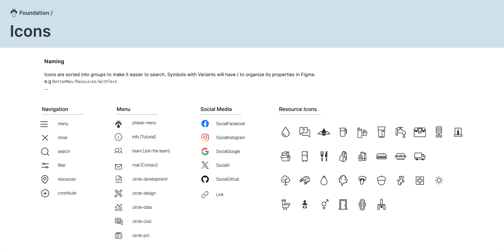
Component Library
Key Screens
Takeaways
Overall a fairly successful update to the existing system with good returns. We're not a major organization so seeing positive growth after remaining stagnant for a time was the approval we needed for this new direction.
Retrospective
These takeaways are a bit more casual reflections, that I like to add as a typical retrospective.
While I was extremely hands on for this project, this was the first major item we covered while I was design circle convener. With this being a volunteer run non profit we get a lot of current students or people interested without a lot of experience. Dividing some of the tasks up and mentoring new volunteers was a change in pace for me.
Mentoring Future Volunteers
I think I could have handled mentoring and task assignment better. Similar to stakeholder management it might be beneficial to examine the relationship up front and then have consistent dialog. I feel like I was a bit too hands off.
