Contract Insight Record Details Config
A reimagining of core system setup pages to reduce implementation time.
Problem
Current setup process involved going to multiple pages to configure a core part of a highly customizable system. This led to frustation and confusion on the user's end and time on the internal implementation team’s end (causing additional billing for more hours).
This was affecting our ability to gain and retain clients.
Solution
With limited time and front end resources, figure out the quickest and easiest ways to address major concern with the concept
Break down existing functionality to figure out where overlap was happening
Find ways to combine existing actions
Introduce new functionality to assist in common pain points
Visual cleanup of various interactions
Result
Working closely with a team of implementation specialists we found ways to simplify overlapping actions and introduce tools to help power users configure large amounts of record types in shorter amount of times.
Reduction in upfront billable hours for new clients
Background
Contract Insight is an extremely customizable contract management system. All pieces of it can be broken down and configured to meet a wide array of clients across multiple market segments. This means that the data which needs to be stored is incredibly dependent on that specific client’s use case.
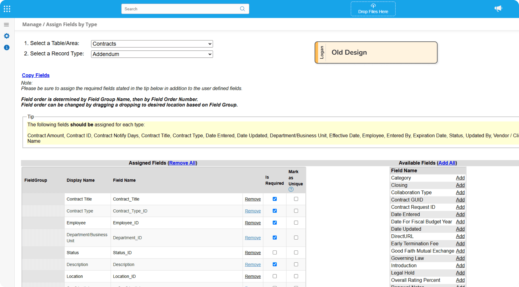
Many different aspects go into a record. The most commonly customized is which fields show up on specific types of records. All of these fields exist under "docks"/ field groups in a single column down the page. More recent introductions to further organize the fields on the page allow users to divide a detail page into various tabs
While having benefits to load times and ability to quickly locate a specific piece of info, the configuration of these tabs was attached on top of any existing infrastructure to create a detail screen.
This led to users having to go through multiple pages just to configure the core of their system, causing frustration with clients and internal implementation specialists
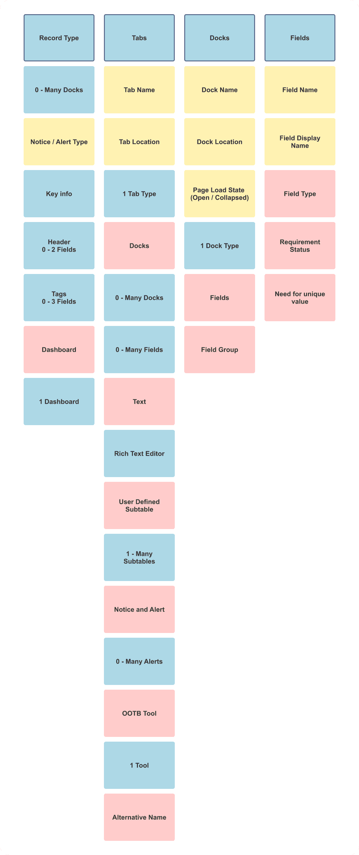
Object Mapping
Since the majority of features were already present in the system, the first thing to do was take inventory. With a short deadline and a complex system, all different combinations needed to be accounted for. This was done using a rough approximation of object mapping to help see connections that might begin to appear.
Research
Starting to get a clear picture of existing functionality, and vague rumblings of the concerns written in the design ticket, the next step was starting to get to the bottom of the main issues. Time was tight, so weighing my options I decided to focus on leaning on the internal implementation team. One one hand this is a group of power users, more familiar with the system than most. On the other, they understand the needs of clients across different typical configurations. In the past they've been forthcoming with client feedback, which they receive often due to being on the front lines with daily customer fixes and complaints.
To best use the limited time, I went with a mix of shadowing how they currently configure and user interviews.
Initial User Flow
As recordings were reviewed, I begin to construct a basic user flow diagram to see if I could pinpoint where gains in efficiency could be made.
Takeaways
With a myriad of issues popping up, there were a few that appeared across different use cases of these configuration screens.
Plan of Action
4 major pain points were found in discussions with the implementation team. I always appreciate bringing in stakeholders early into the process to help manage expectations, so I began workshopping with the same group of users. Right of the bat we had a few items that we thought we could work on together, all revolving around the flow.
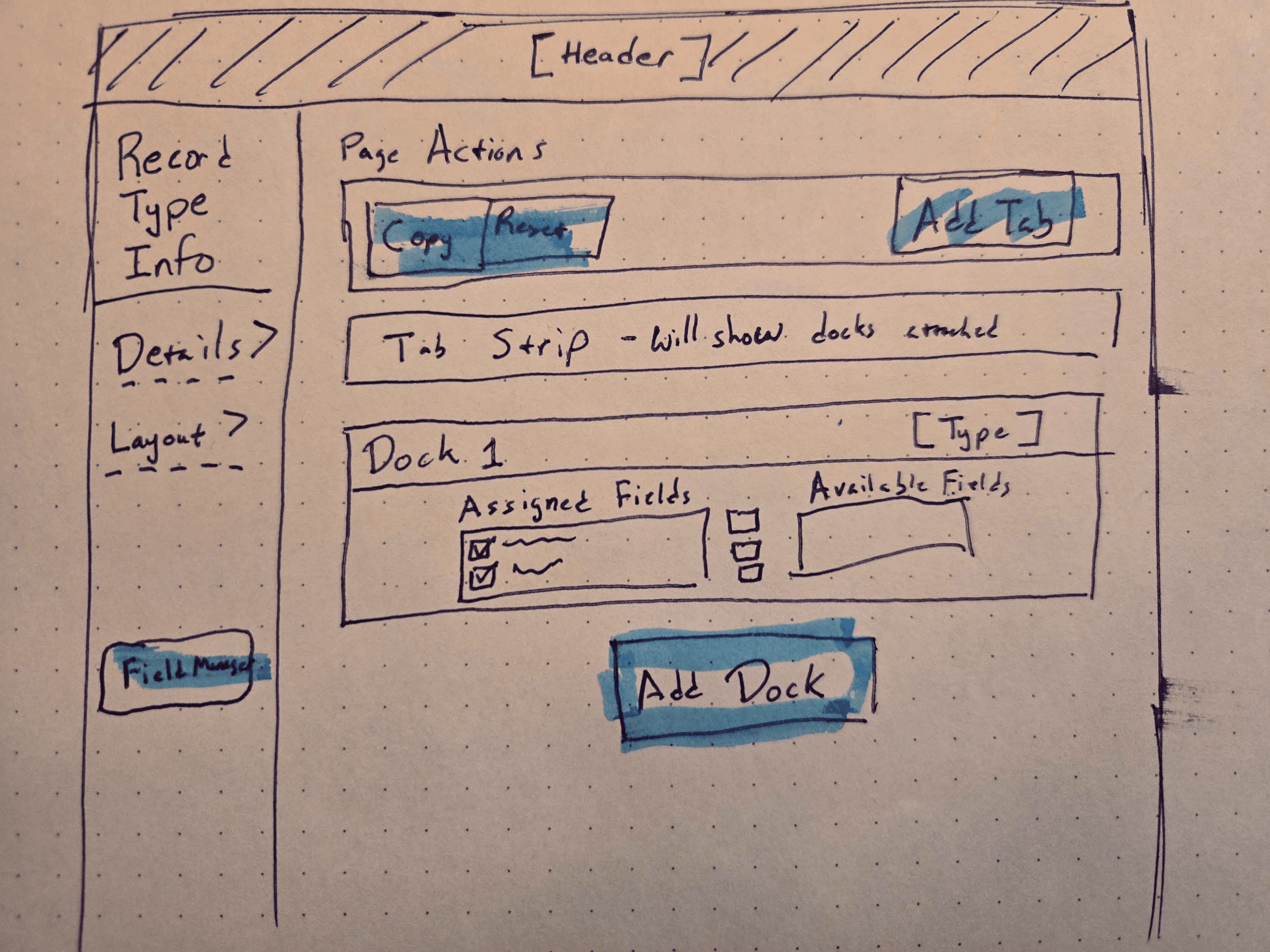
Lead a workshop where as a group we began to sketch what might be a potential solution
Initial Sketch
After a few thoughts of trying to add extra actions to the existing page, due to the project scope, we decided to to an exercise to imagine a north start project, it couldn't hurt right?
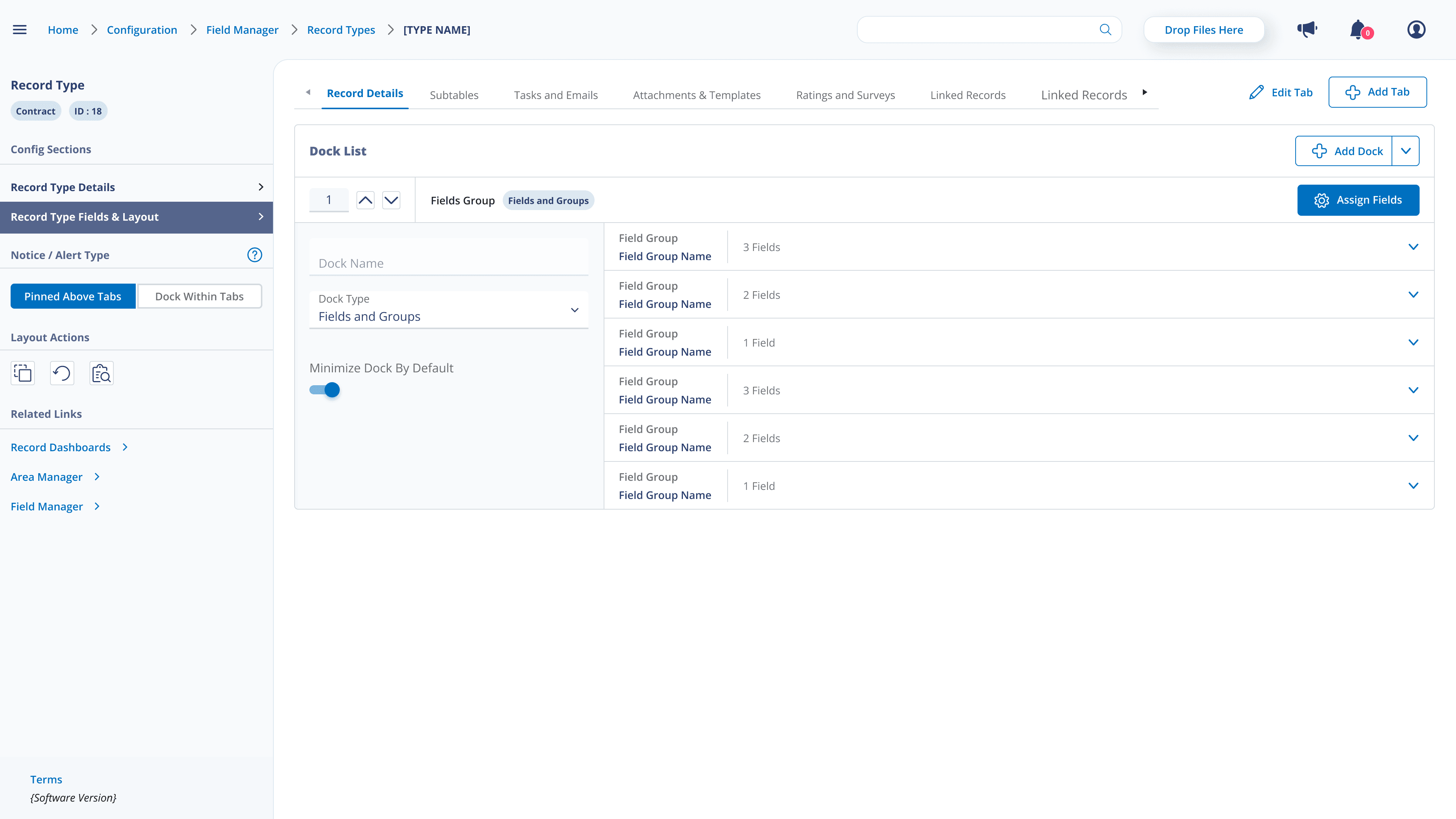
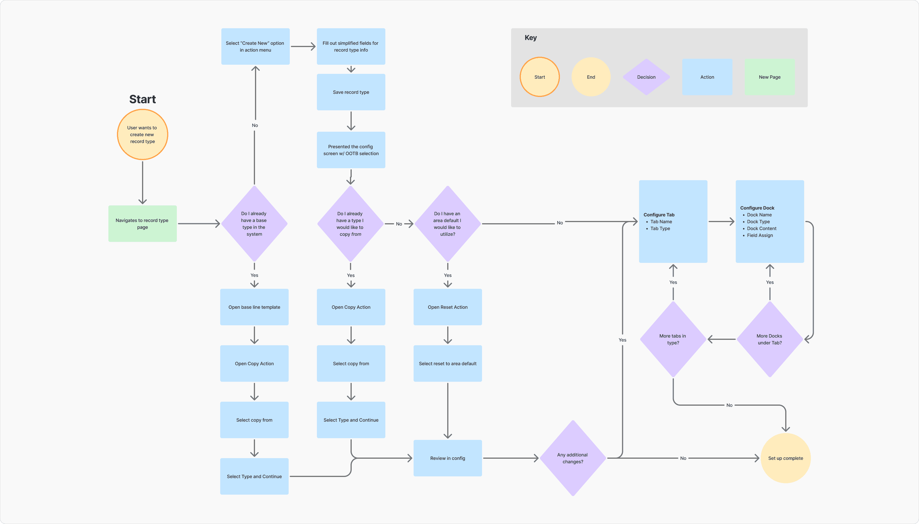
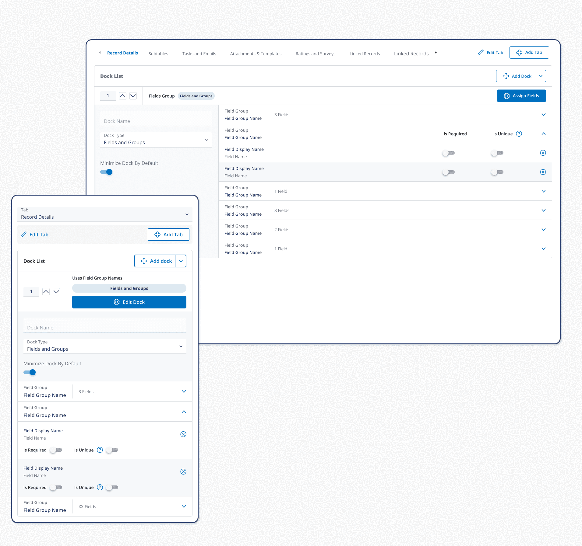
What we came up with was a concept to combine all 3 major screens a user was going to for configuration, and laying it out in a similar fashion to the detail screen itself. Including the list of fields here as a combo assign + display cut down on pages visited, repeated actions, and solved the need to save and go to the detail screen to review.
The inclusion of a copy action allowed for configuration that aligned with the typical implementation strategy of finding all common fields to configure first across different types.
Proposed User Flow
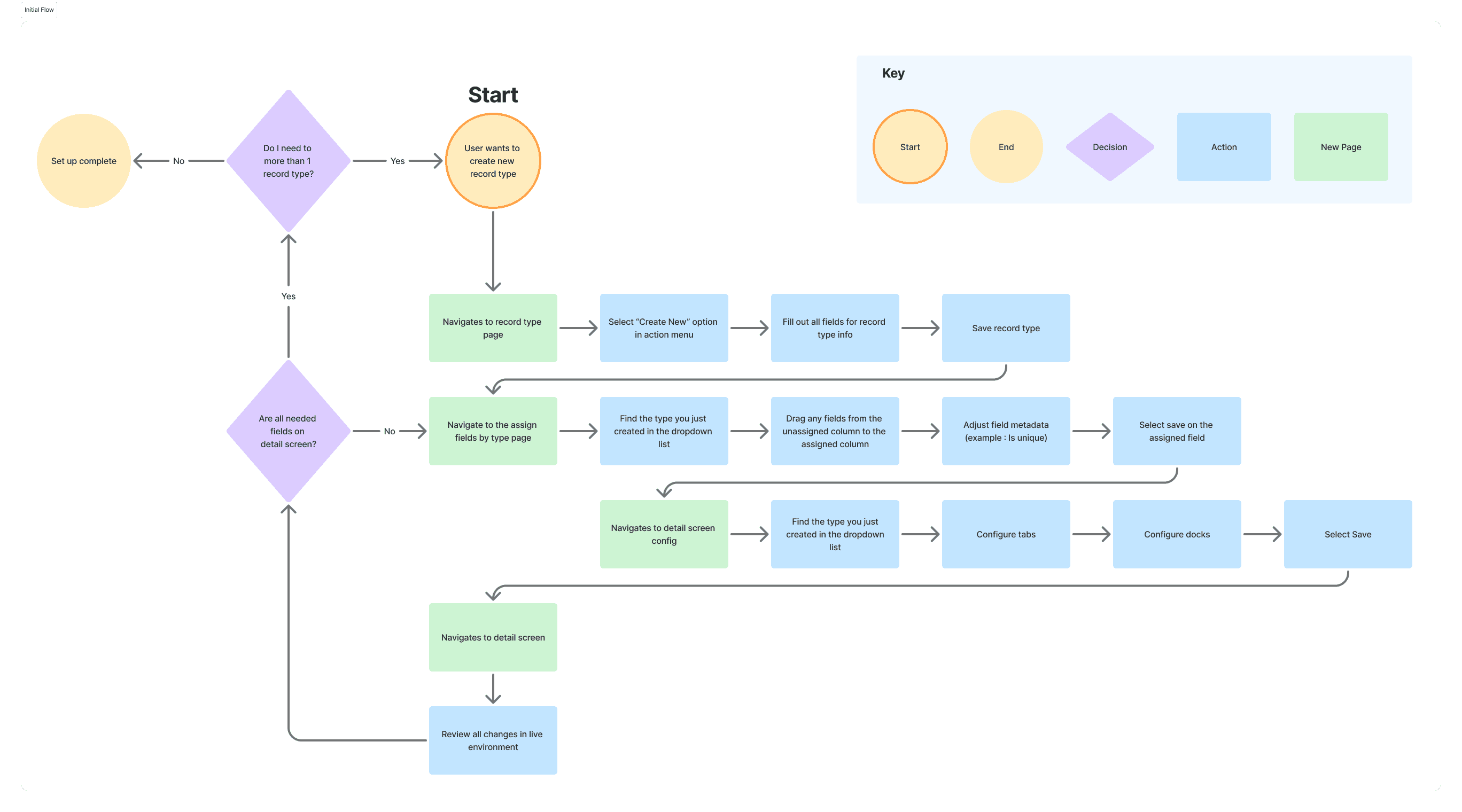
With a rough idea I went ahead and mocked up a proposed user flow to bring to the dev team for sign off. With a larger scope it was a gamble, but with the backing of the implementation team explaining the benefits from the system configuration side we got the go ahead.
The new flow had many more decisions a user could make, but with a careful hand to place them, and the benefits provided to configuration speed, we thought the trade off on mental load.
Comparison
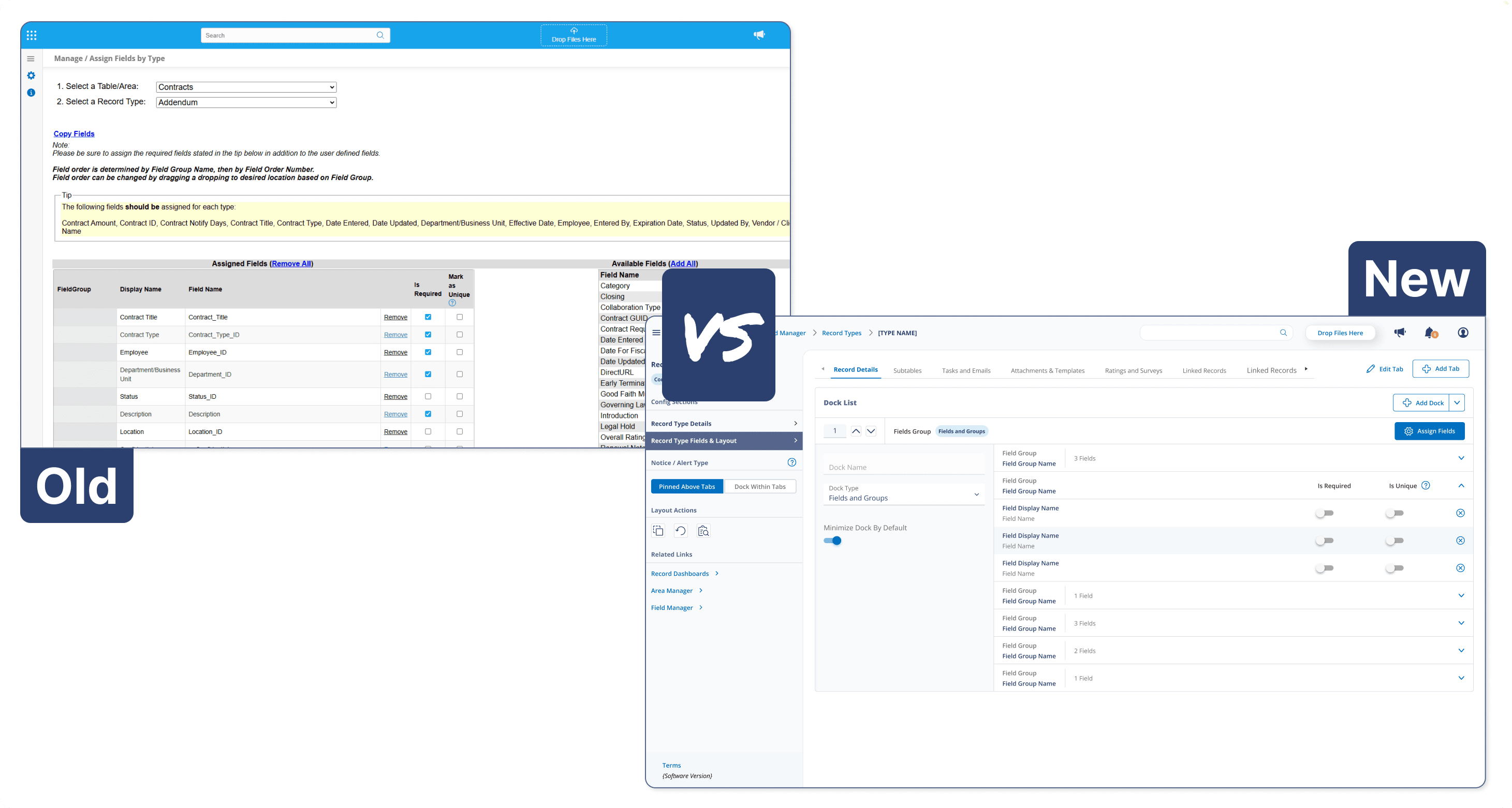
Key Screens
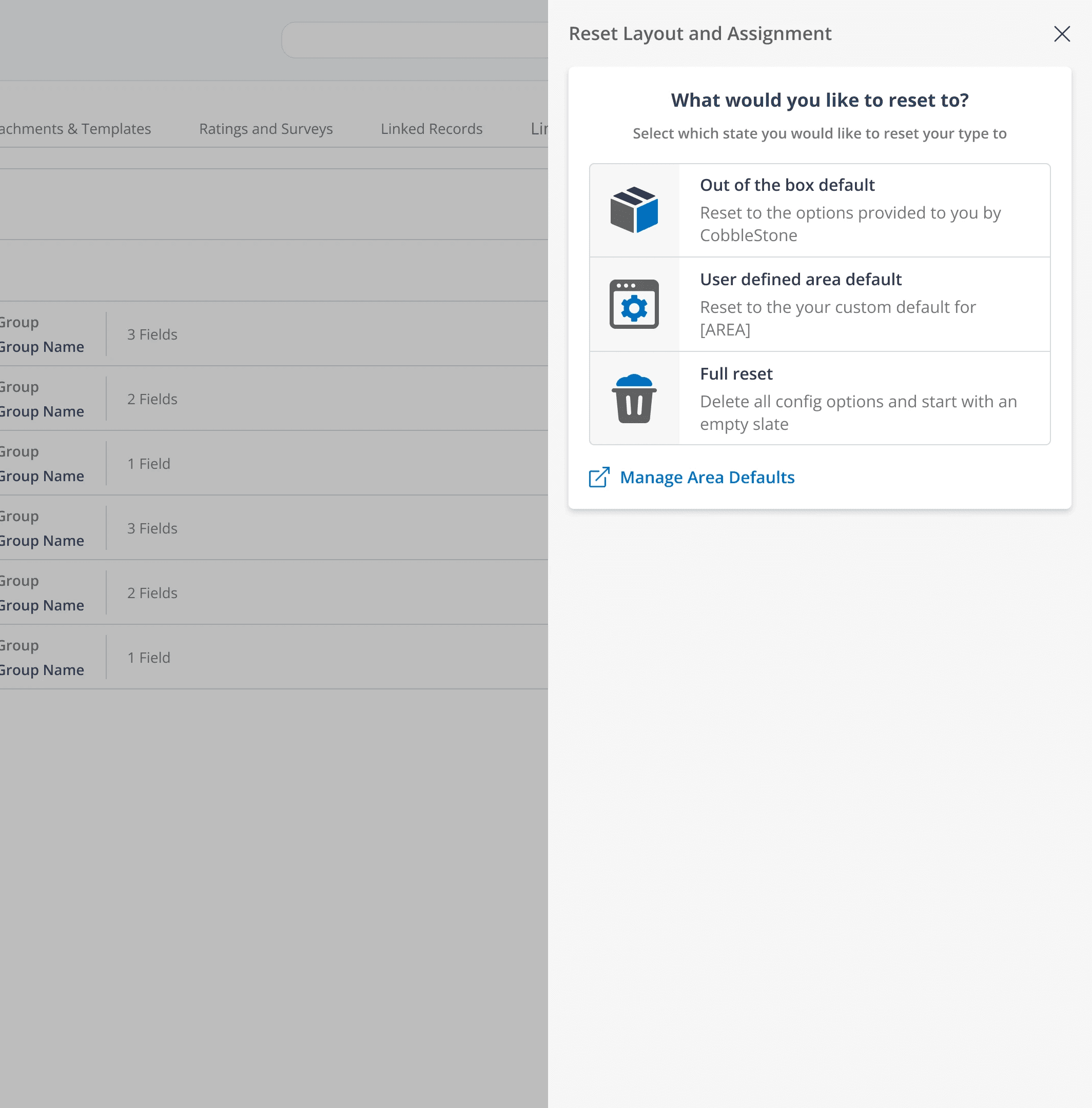
Reset Panel
Speaking to implementation we had a 2 main concerns with resetting.
You could only reset separately to an empty state in both the field assignment and field display config screens.
We offered an out of the box option that once changed, could not be retrieved.
We remedied that with a full suite of reset options on the combined interaction to speed up the workflow of implementation specialists.
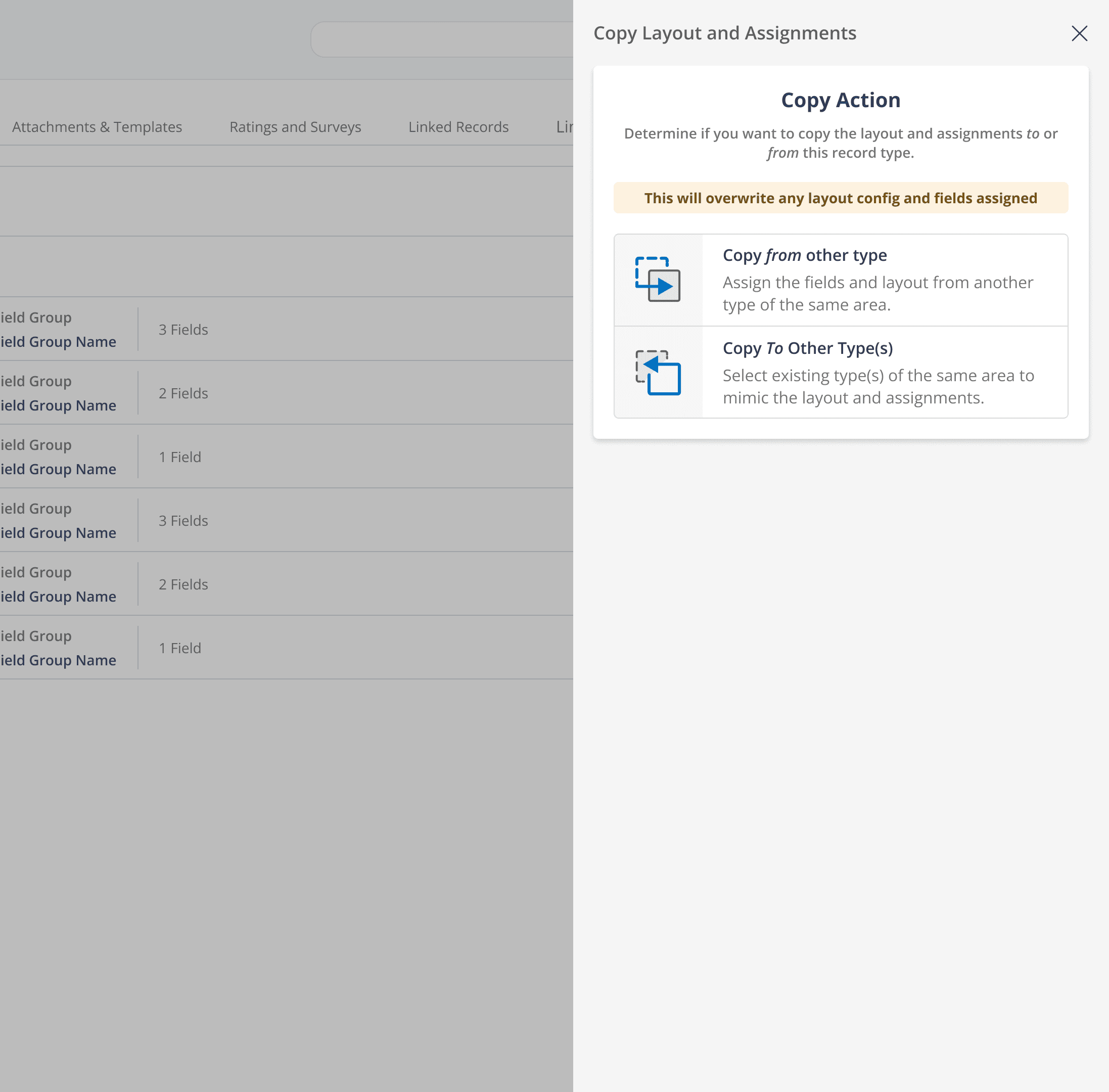
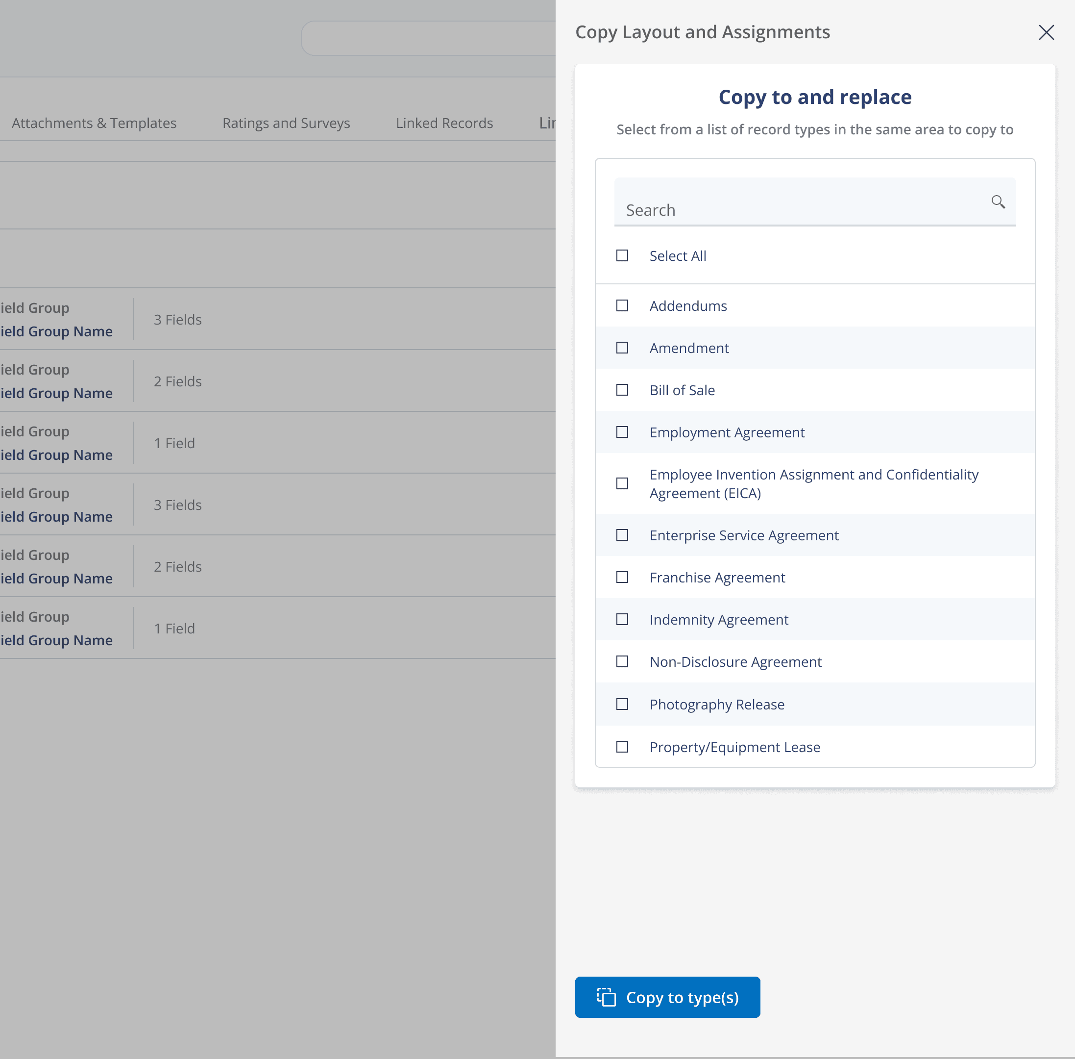
Copy Panel
We had the ability to copy 1 to 1 field assignments, with no copy function on the display config.
The most used interaction for starting a system from scratch was to create a template with all like fields on field assignment and then repeatedly pressing copy and selecting a type until all were completed.
We expanded the "Copy To" functionality to a 1 to many interaction.
For existing clients and users, to add 1 new record type, the type would have to be created and then navigated away from to the template. The template would have to be copied to the new type, before being navigated back to.
We introduced a new 1 to 1 "Copy From" to assist existing clients expanding their system offerings.
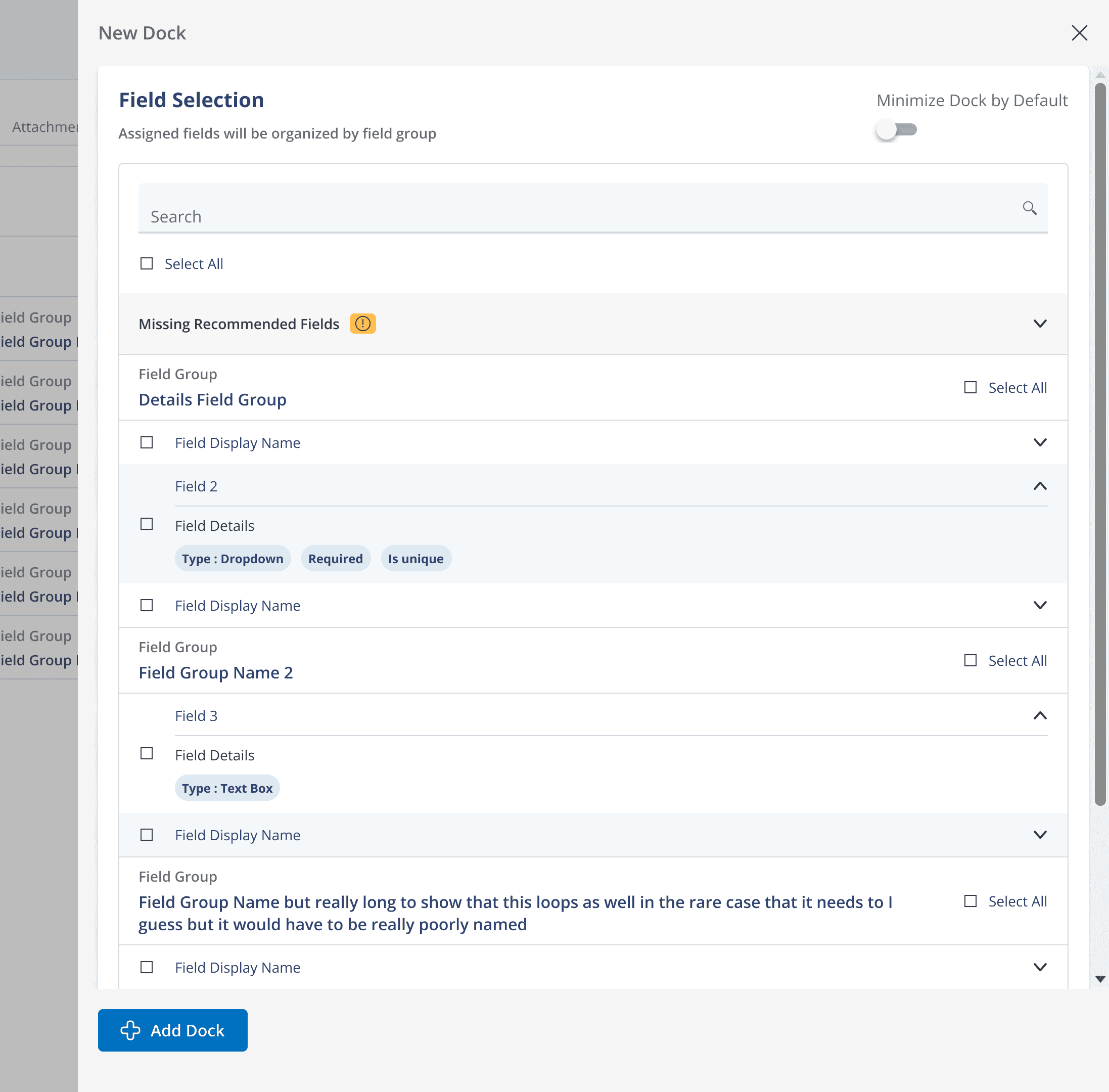
Combined Field Assignment
Finally the largest piece of functionality. Combining the actions of field assignment and display config was fairly straight forward from the front end. We took the existing screen, focused around a list of available fields in alphabetical order and a list of selected fields with options.
After discussion with implementation, we found out users typically heavily rely on the field group configuration, so leaning into that we organized by groups, allowing for group wide quick select, and bubbling some key info fields into their display so you wouldn't have to go digging for it elsewhere.
Takeaways
This project took 6 month to scope, design, and provide design support to developers + QA. We kept multiple stakeholders, from the devs to the CEO in the loop throughout the entire process, as it is always better to have a conversation vs a handoff. We introduced 3 new button types, 2 new ways to handle empty states, a polished error catchment process, and an entirely new experience over a prototype spanning 250 hi fi mockups.
Retrospective
These takeaways are a bit more casual reflections, that I like to add as a typical retrospective.
A lot of good and benefit was done with this project, we allowed both end users and internal specialists rapidly deploy record types compared to the other way. And we focused on a lot of that throughout the case study, but I like to look at every project as a learning experience and explore what we could have done better.
Looped in more user demographics
I don't want to hide behind the limited scope of time that we had to complete this. Looking back I think I would have tried to introduce these concepts to a wider array of user types, even if asynchronously. It worked out this time but it was a gamble. The group we did discuss with, had a wide array of market segments, but were all clustered in the super user level of experience.
Time Budget
We did end up going over time on this project. The project was initially scoped out to only really include actions to help move between screens. With keeping all stakeholders in the loop and finding value as a team during the exploration phase allowed for us to more completely solve the problems users were facing.
